The development of generative AI is significantly impacting both my professional and personal life. Just last Saturday, my son was upstairs running on the treadmill in the evening. With summer approaching, he suddenly noticed a lot of bugs and moths accumulating on the walls and under the lights. He panicked because we had just told him the day before that he needed to keep the window closed when the light is on.
In a clever move unexpected from me, he turned to ChatGPT, described the situation, and asked for advice on how to handle both the moths and our reaction as parents. He received a helpful response and decided to wait until Papa was in the shower and approached me, apologized for the situation, and asked for my help in using the vacuum cleaner to clean up all the insects.
This experience made me realize that generative AI is not only transforming my work life but also having a profound influence on our personal lives. I would have googled first.
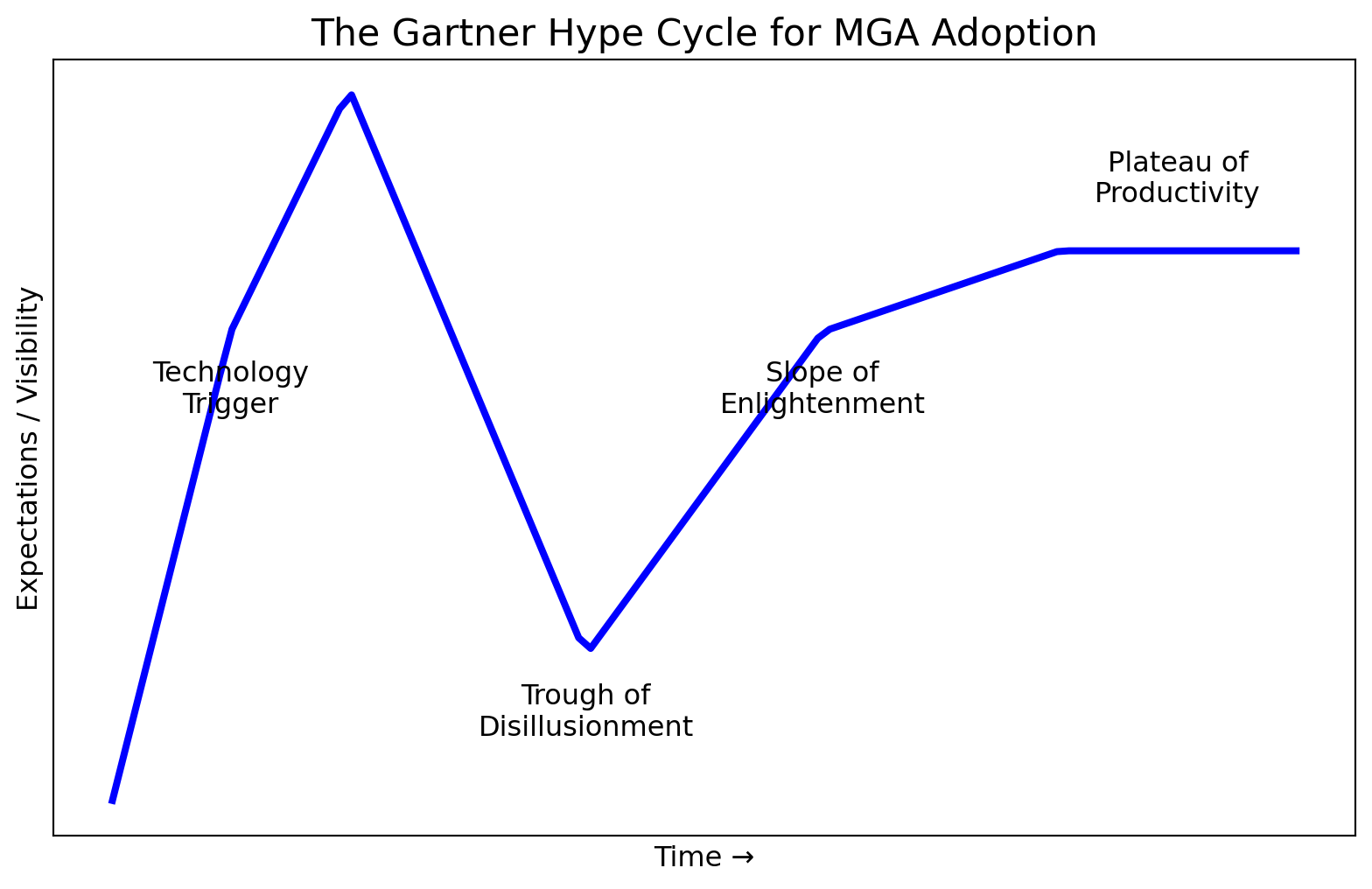
I participated this microsoft AI day and a microsoft colleague also shared his experience with AI and AI agents. He described a curve that starts with high expectations, dips into disappointment, and then slowly regains hope, ultimately leading to productive use. I had almost exactly the same experience. In preparation of the slide deck, I asked our internal genAI to generate code for plotting the curve and it actually pointed me to the Gartner’s Hype Cycle concept.
I have collected some tips and experiences and continue to explore its capabilities. My next exploration will be vibe coding, as Ismael has introduced it to me yesterday.
import numpy as npimport matplotlib.pyplot as plt# Create figure and axisplt.figure(figsize=(10, 6))# Define the points for the hype cycle curvex = np.array([0, 1, 2, 4, 6, 8, 10])y = np.array([0.1, 3, 4.5, 1, 3, 3.5, 3.5])# Create smooth curve through pointsx_smooth = np.linspace(0, 10, 100)y_smooth = np.interp(x_smooth, x, y)# Plot the curveplt.plot(x_smooth, y_smooth, linewidth=3, color='blue')# Add labels for each phaselabels = [ (1, 2.5, "Technology\nTrigger"), (2, 4.8, "Peak of Inflated\nExpectations"), (4, 0.5, "Trough of\nDisillusionment"), (6, 2.5, "Slope of\nEnlightenment"), (9, 3.8, "Plateau of\nProductivity")]for x, y, label in labels: plt.annotate(label, (x, y), fontsize=12, ha='center')# Add title and labelsplt.title("The Gartner Hype Cycle for MGA Adoption", fontsize=16)plt.xlabel("Time →", fontsize=12)plt.ylabel("Expectations / Visibility", fontsize=12)# Remove ticks for cleaner lookplt.xticks([])plt.yticks([])# Add gridplt.grid(True, linestyle='--', alpha=0.3)# Save the figure## plt.savefig('mga_hype_cycle.png', dpi=300, bbox_inches='tight')# Display the plotplt.show()